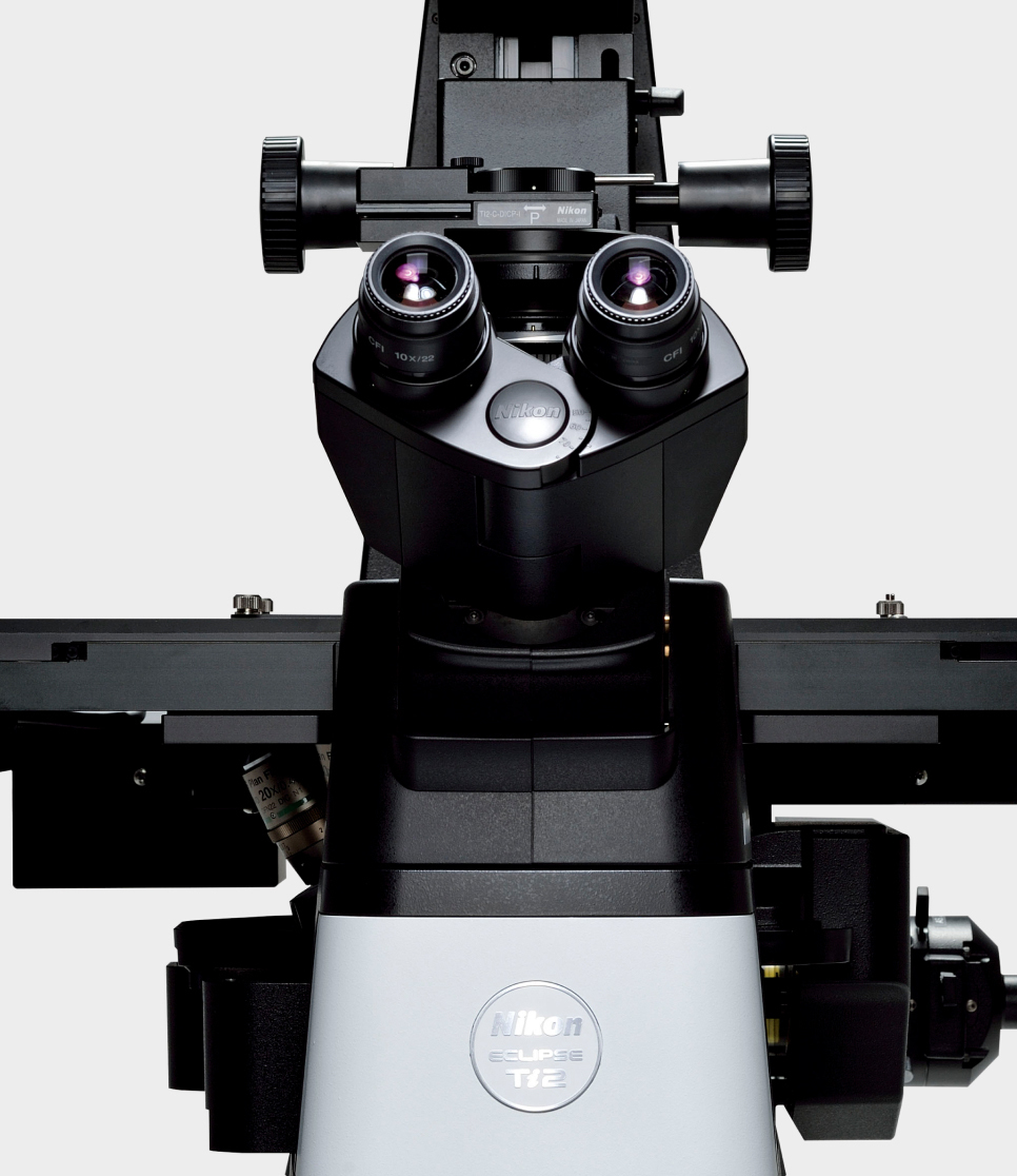
ECLIPSE Ts2 / Ts2R

Jan. 10, 2017 | Inverted microscope

image

Pursuing an iconic, signature design for microscopes

Clean, clear design that fits many operational environments

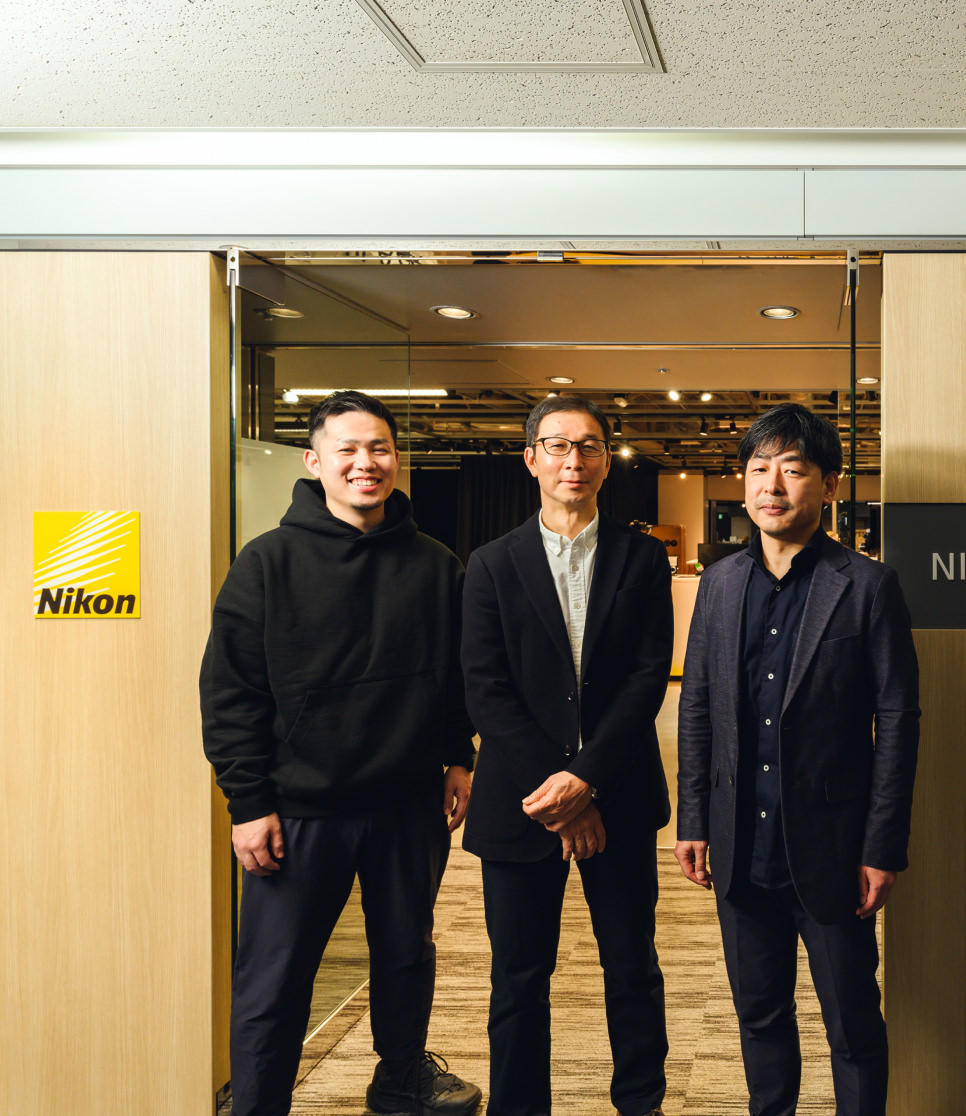
Pioneering design innovation of microscopesMr. Sumito Watanabe, Product Designer

image
image

Microscopes are marketed in relatively long product cycles and come with many accessories, making it hard for us to create consistency in products.

Considering that situation, the Inverted Microscope Ts2/Ts2R project provided us with a great opportunity, as we can develop two models side by side. As well as this factor, we felt the need to establish a signature design that would symbolize Nikon microscopes and inspire future releases.

Our goal was a design that would give great consideration toward operational convenience, and encourage a wide range of users, from researchers to students, to adopt our microscopes. We also aimed to achieve a clean design developed by paying close attention to operating environments, as well as a timeless, sleek form.

image
image
image

“Clean and clear” as
the design conceptMr. Tatsuya Kobayashi, Product Designer
Mr. Masaaki Yanagisawa, Product Designer

image

For the development of Inverted Microscope Ts2/Ts2R, we decided to establish the design concept of “clean and clear.”

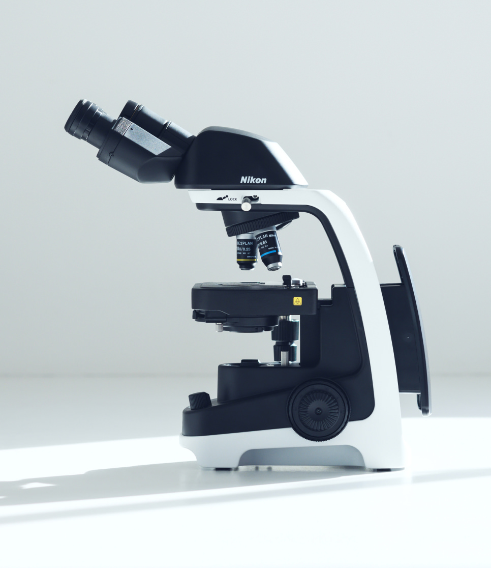
“Clean” referred to our ideal form with minimum unevenness on the surface, that would facilitate maintenance, as well as a color that projects a clean feeling. “Clear” referred to an iconic form that would help people clearly identify the product, as well as to the clear contrast among color schemes.

We explored designs where these two elements coexist, created many sketches and refined our ideas. This process yielded a key sketch.

image

It comprised lines that follow the movement of light and simple protrusions. It was a clear, iconic design, that would ensure the product was easily recognizable. We believe this simple signature design will widely inspire those of future microscopes.

Visualizing the uniqueness of inverted microscopes

image

Many Nikon microscopes conventionally employed black parts as a motif for sections along which light travels. While following this tradition, we chose white for the main body. The result was a high-contrast, monochrome body, that clearly exhibits the path the light takes.

Furthermore, the optical systems and mechanical components are concentrated in the lower half of inverted microscopes. The upper body design should be simple, we thought. The result was an agile but stable design, in which the slim upper body gradually spreads out toward the base, like a trapezium.

Bringing our design concept to life

image

Deciding details of the new signature design took an extra-long time. Recreating actual working situations, we examined operability using full-scale mockups of components. We meticulously checked details like the positions of dials and switches as well as the depth of the notches edged around dials, while actually looking into the eyepiece lens.

image

We also made a 1/10th mockup of the microscope to view the overall balance, while also utilizing 3D and CG data.

We shared design images with engineers during much earlier phases of the process than usual, and were united with the same goal of creating a top-quality product together. Organizing the process in this way greatly assisted us in making this project successful.

Microscope body color that stylishly matches the current operational environment

When deciding the Ts2/Ts2R body color, we extensively explored which would be the best shade of white. Conventional models used what we call “office white” with a yellow tint, which has been popular for office furniture for many years. Microscopes of this color used to blend well with the surrounding environment while any dirt remained relatively unnoticeable on the surface. But now more and more operating environments, including their furniture and interiors, are in pure white. We proposed the use of a new white, in order to establish a new image of Nikon microscopes for the future.

image

We studied the colors of competitors' products and the shades used in various environments, with color charts in our hands. This helped us develop an ideal color that optimally matches current styles and operating locations. Applying black to the light path created a contrast of black and white, emphasizing the clean form. We named this new color, clean white.

Future designs for Nikon business products

The lineup of Nikon business products is expected to increasingly expand. We are determined to challenge ourselves and accomplish the very best designs possible, with thorough consideration of productivity, workflow and the operating environment from users' points of view.

image
image
image